Color Palette for intense sunsets
Usually, I start a new painting based on a scene or a photo. I try to match the colors in the photo, or when I paint on location, I try to match them with what I see in front of me. But to get a fresh perspective, we can switch things up a little.
Why not start with the choice of colors and deciding on a subject based on that?
When the sky is on fire
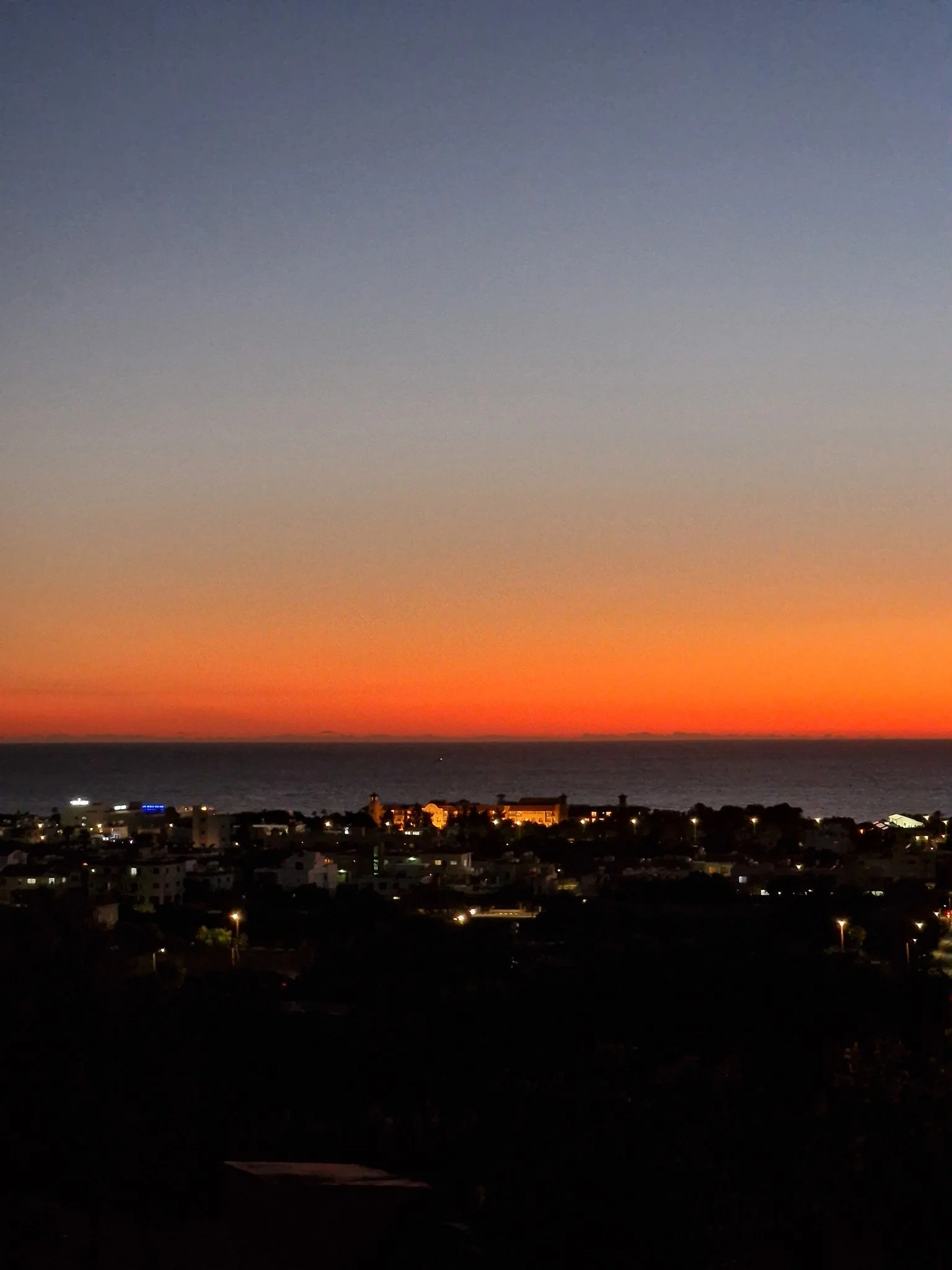
A few weeks ago, we were sitting on the terrace of a restaurant in Paphos, witnessing this amazing sunset. The colors grew more intense with every passing minute. I have seldom seen a sunset with so dark and intense colors. The glow remained almost until darkness fell, as you can see from the city.
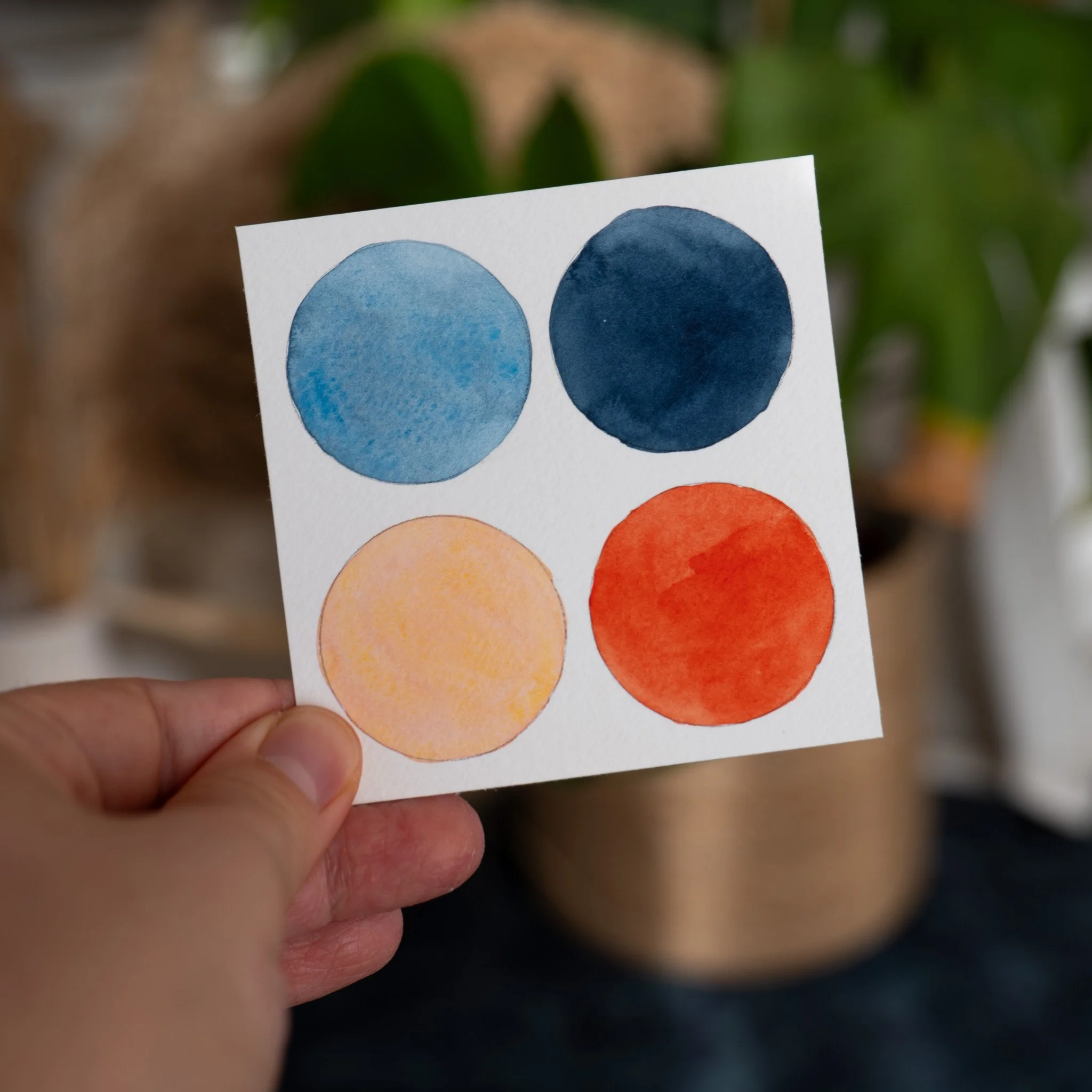
These colors make a very nice color palette. If you want to recreate it, you can see which colors I used to mix it below. All colors I used are from Winsor & Newton.
Inspiration can come from many origins. In this case, we take colors from a photo. But you can paint a whole different scene with them. It doesn’t have to be a sunset.
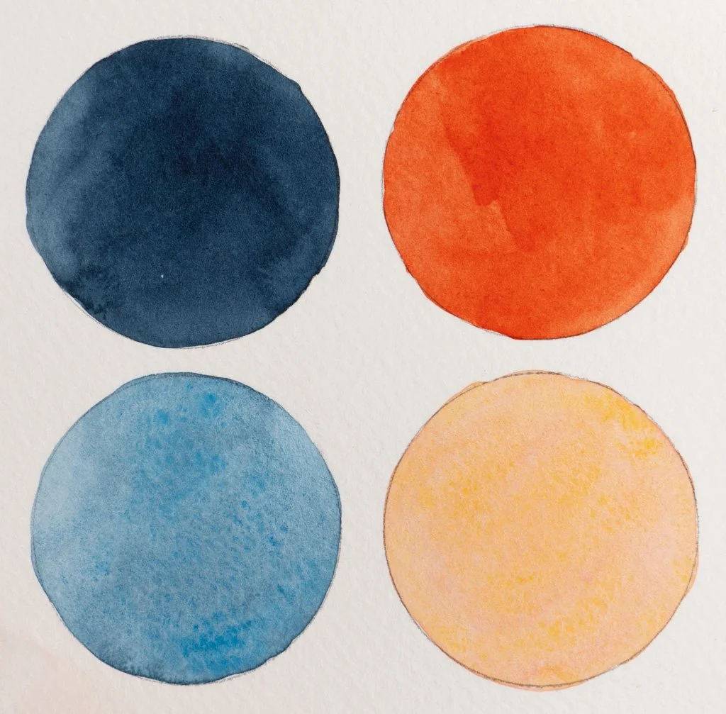
The color mixes:
Dark Blue:
Indigo + Payne's Gray
Light Blue:
Indigo + Payne's Gray + Cerulean
Dark Orange:
Winsor Yellow + Winsor Red
Light Orange:
Lemon Yellow Deep + Winsor Red + a lot of water
Free PDF Guide with 3 step-by-step Tutorials
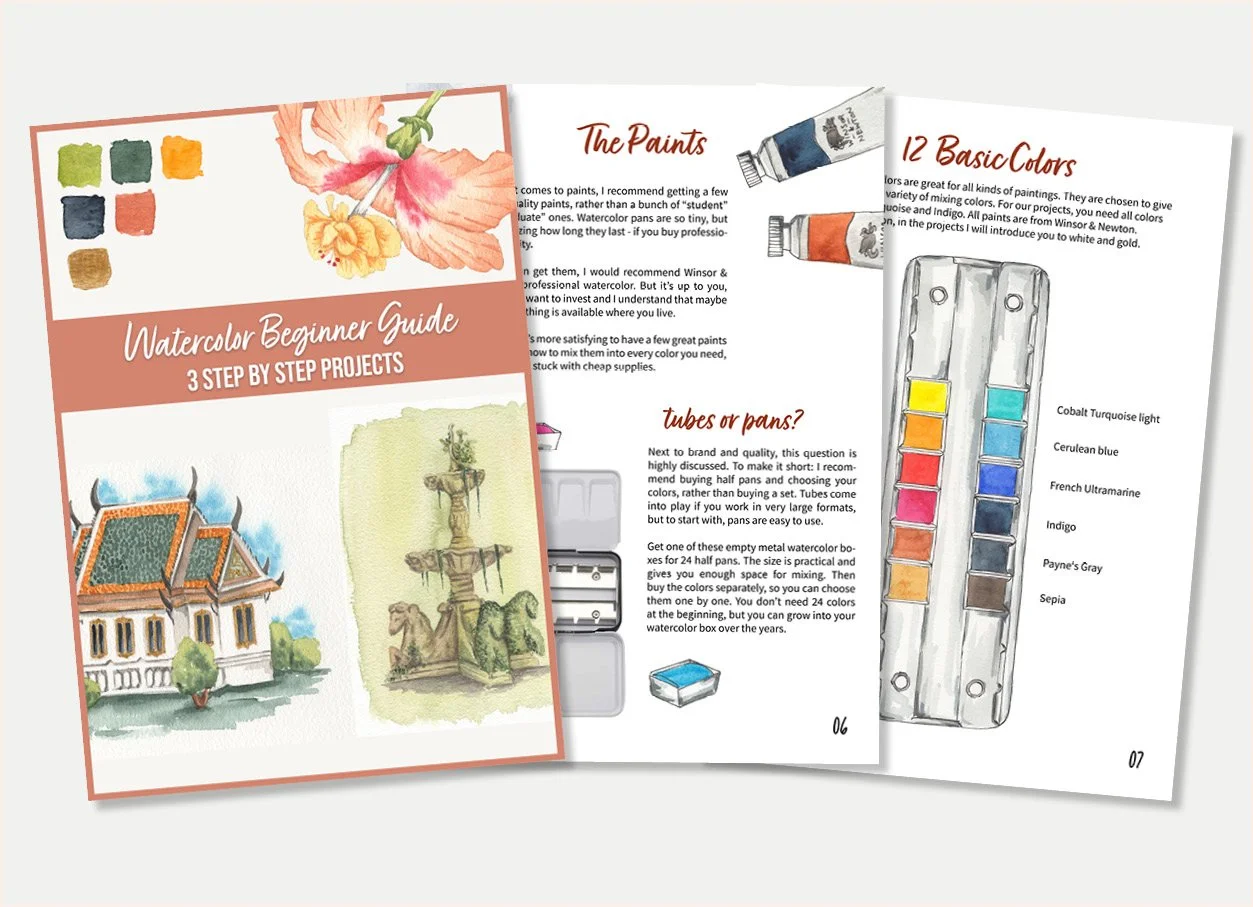
When joining the “Watercolor Magazine” Newsletter, you get this PDF Guide as a Welcome Gift.
Enjoy these beautiful step-by-step paintings. From the best material to color mixing, everything you need is covered.
The best? In the Guide, you’ll find a drawing template for every project you can print and transfer to your watercolor paper.
You will join the free “Watercolor Magazine Newsetter”. You can unsubscribe anytime. Your Data is 100% safe.
Inside the Guide
List of the best Watercolor supplies
Colors Mixing recipes
Step-by-step tutorials with pictures & text
printable drawing templates